good
good use of editing techniques - blurred vision
Good use of effects on shots
Good description of character on introduction
Good use of sound
Different ways of showing lost identity
Good use of camera angles
Very nice camera shots/angles
Good convention of identity with information of character lose of memory also with hand held shots and canted angles
Use of music added with effects
Video effects set the scene well
Good titles "word things" were good
Good editing
Good use of camera angles
Good video effects
Conventions of identity
The credits were original and how they mixed with the words was good
Good blurred shots
Really liked the use of definitions leading up to the title
Thought the sound went well with the narrative and added to the atmosphere
Good use of props as the audience asks questions
Sound track created suspense and unease
Ticking clock very effective as creates suspense
Disorientated effect was very effective
bad
Could improve on soundtrack to get a feel of disorientation
Strange cut in the middle
Don't really understand it
Abrupt change wasn't very good
Maybe fade out before the end
Main title was a little unclear
Titles could be clearer
Ending is odd
Credits not very dynamic
Include more varied shots
More camera work could have been used
Monday, 21 March 2011
Feedback on final cut
Thursday, 17 March 2011
Oblitus Final
Thursday, 10 March 2011
Editing:
With our feedback we found that the titles lasted for too long and we should have included music to help add to the genre. The continuity is slightly off because the shots move around too much and the editing pace is slow, so not much is happening. We need more transitions.
Sound:
We have a good use of diegetic sound effects and the silence is said to have been effective. A sound track could be used to carry on a narrative. Because of the lack of a sound track, some laughing is heard in the background which in future will be cut out.
Camera Work:
Our use of a point of use shot is good and we have a good range of shot types i.e. close up.
Mise En Scene:
The costume our main character uses is seen as appropriate. The lighting on the bedside table is a little too dark making the footage slightly unclear. One group felt we needed to expand our use of location though we feel this is inappropriate as this is where the scene is set, though once the credits have been put into out final cut, we will make sure it is more obvious why this location is important.
Titles:
To another group the title was unclear, this may be because it is a latin word which they are not familiar with, though we will make sure the title becomes more clear. We haven't any credits yet though will add them in in time fore the final cut.
Thriller Conventions:
The zoom into the eyes is seen as a good thriller convention, though no crime is present and no weakness is shown though we will make his weakness (amnesia) apparent in the credits. No suspense has been built up so perhaps we will be able to do this before the alarm goes off. One group was confused as to why no identity was shown though this is because it is a conventional thriller based around lost identity.
Labels:
Chloe Housden,
Heidi Izatt,
Sarah Jebb
editing action plan
Our group has until next wednesday to finish our final cut so this is what we need to add to our thriller before then:
- Our opening credits still need to be added
- Music needs to be added
- Edit out laughing
- Remove picture of zebra crossing
Labels:
Chloe Housden,
Heidi Izatt,
Sarah Jebb
Wednesday, 9 March 2011
Oblitus - Rough cut
Labels:
Chloe Housden,
Heidi Izatt,
Sarah Jebb
Wednesday, 2 March 2011
Sonic mood board
This is our sonic mood board. We feel it represents what we hope our final film will be like very well, as we have included some of the key motifs such as a clock, and someone laying on their side with their eyes open.
Labels:
Chloe Housden,
Heidi Izatt,
Sarah Jebb
Wednesday, 16 February 2011
In our lesson, we used the HD cameras and went out filming different shot types, to experiment and see which we would like to use in our actual film. The ones we have put into the above footage are the shot types we will be using for our thriller opening.
To create a sense of distortion, we have decided to add blurs into the point of view shot. In the test footage we used a range of different blurs though we have decided the best one to use to create the greatest sense of distortion is 'Radial Blur'.
To create a sense of distortion, we have decided to add blurs into the point of view shot. In the test footage we used a range of different blurs though we have decided the best one to use to create the greatest sense of distortion is 'Radial Blur'.
Labels:
Chloe Housden,
Heidi Izatt,
Sarah Jebb
Thursday, 10 February 2011
Labels:
Chloe Housden,
Heidi Izatt,
Sarah Jebb
storyboard
This is our storyboard whIch we all contributed drawIngs to. Although it has not got many frames, we feel the shots we are experimenting with are very complex.
Labels:
Chloe Housden,
Heidi Izatt,
Sarah Jebb
Wednesday, 2 February 2011
Top 2 Lists of Skills
2 Top Positive Points-
- Varied Shot Types
- Good Use Of Props
2 Negative Points-
- Poor Titles
- Poor Framing at the beginning
Labels:
Chloe Housden,
Heidi Izatt,
Joel :),
Sahib
peer evaluation of children's film
Good points
- Good storyline structure
- Varied shots
- mise en scene - the props
Bad Points
- background noise was unpleasant to listen to throughout
- shots were unsteady sometimes
- opening title sequence didn't have appropriate music (too eerie) Also it was too long
Pitch
The dates we would wish to take the camera are the 12th and 13th of feruary which are on a weekend.
Thursday, 27 January 2011
Pitch
Sub Genre and overall ideas:
The sub genre of our film is a psychological thriller based around the convention of lost identity. Our opening sequence will include our main character being woken up by an alarm clock and not knowing where he is. At this point within the film, the audience does not know whether the male character is the antagonist or protagonist, this however will not become apparent to the audience throughout the opening sequence.
Fonts, texts and Graphics
http://www.dafont.com/new.php?page=12&text=Oblitus
The text we have decided to use is on this website, we are using it because we feel it gives a good effect and represents a psychological thriller well. We will use this font when showing the title of our film which is 'oblitus' which is latin for forgotten. We chose this name because of its relation to amnesia, though amnesia is already a latin word so we decided to use this instead.
Title- Oblitus
At the beginning of the sequence, the credits will appear one by one with typewriter fonts, and the letters appearing on the screen one by one as if being typed with a typewriter which relates well to a classic psychological thriller. whilst this is happening, behind the credits there will be documents and information about the condition amnesia alongside pictures of our main character doing everyday things like walking in the street, the audience is able to see that the man in the photos is unaware that his picture is being taken. There will be someone flicking through the photos ad documents, thought the audience doesn't see who. The location of the filming will be Sarah's house, the bedroom being used will be her brother's room and the photos will be taken in Sarah's local village of Balsham.
Labels:
Chloe Housden,
Heidi Izatt,
Sarah Jebb
Wednesday, 26 January 2011
Ideas for thriller opening sequence
This lesson we are discussing different ideas for our thriller opening sequence. In this, we have to consider the different thriller conventions and sub-genres that we have looked at in previous lessons in order to create a detailed account of our chosen ideas and plots.
We decided that we wanted to look further into creating a psychological thriller.
Idea 1) The first thing we looked at was the idea of someone losing their identity. We discussed the idea of somebody suffering from amnesia. They would wake up and not know where or who they were. If we were going to go through with this idea for our final project, we would probably shoot somebody waking up and show the confusion they go through as they try to understand what has happened to them. To this storyline we could add in characters such as, forgotten love interests, family, doctors, police etc.
Idea 2) Another idea we came up with was to show someone who leads two lives. An idea of this could be a husband/father who at home seems like a typical family man with a normal job but when he leaves home to 'go to work' we discover he is actually a spy/assassin/bank robber etc.
Idea 3) The next idea was to show the life of someone who's has had their identity stolen. By this we mean that there is somebody trying to impersonate our protagonists identity. They could realise this themselves or be informed by government/police/FBI etc. This could be because the antagonist impersonating them has framed them by committing crimes, and the real person is getting the blame.
The idea we found best out of these was the idea of lost identity as we decided this would be the best one to fit into a two minute opening as we feel we could achieve more with this idea whilst keeping in with the time
Labels:
Chloe Housden,
Heidi Izatt,
Sarah Jebb
Monday, 24 January 2011
Production Logo
In our lesson today we looked at different production. The one we have chosen to analyse is from Icon Productions. The logo represents the audience by looking very mature and looks like a painting which is something that older audiences may recognise. The name relates to the word iconic which also matches the type of audience.
Labels:
Chloe Housden,
Heidi Izatt,
Sarah Jebb
Wednesday, 19 January 2011
Analysing two past student videos
The first clip we watched was called August 13. We thought this was a very good example of a thriller opening sequence.We analysed why we thought this using the marking criteria.
 |
| Picture 1 |
 |
| Picture 2 |
 |
| Picture 5 |
 |
| Picture 4 |
 |
| Picture 3 |
 |
| Picture 6 |
First of all we looked for a shot being held steady where appropriate, We decided this shot in the the elevator was a good example as it shows he was quite calm and still and the people looking for him were running up the stairs. See picture 1.
Next we focused of framing a shot, excluding and including elements. A prime example of this was when we realised something had been taken from the bank, and the next shot was of a man walking away from the bank with a brief case in his hand. The use of the zoomed in shot brings the audience attention particularly to the brief case. See picture 2.
In the sequence they used a variety of shot distances. Including, still, panning and zoom. An example of this in the clip that we found particularly impressive was when the chase between the man with the brief case and the two men began. The begins with him walking down the street, and as he begins to run the camera zooms out to give a long shot, this exaggerates the pace of which he is running. See picture 5.
All the scenes shot in used in the final clip, were appropriate to the meaning of the film. It was made apparent to us from the beggining of the film that this would be an action thriller, and also the final shot of the sequence where the three men are stood on top of the roof is very typical of this genre. See picture 6.
Another thing we focused on in this sequence was the selection of mise-en-scene. As well as the props and costumes used, a brilliant example was the set location used. After seeing the prop of the brief case in the mans hand as he walking, we see what he is moving away from, the bank. The filming is set in a busy high street, which is another typical convention of an action thriller as busy high streets make it easier for the person escaping to lose the people chasing them. See picture 3.
They used continuity editing, to build tension in the chase and make the meaning apparent to the viewer. Using varied shot transitions and effects.
The use of titles was good because as each new charactor came into a shot alone the shot would freeze before showing the title with their name on it. See picture 4.
Labels:
Chloe Housden,
Heidi Izatt,
Sarah Jebb
Marking Criteria
Marking Levels
Our video will be marked out of 60:Level 1 - up to 23
Level 2 - 24-35 - Basic
Level 3 - 36-47 - Proficient
Level 4 - 48-60 - Excellence
Marking Criteria
- Holding a shot steady where appropriate
- Framing a shot, including and excluding elements
- Using a variety of shot distances
- Shooting material appropriate to the task
- Selecting mise-en-scene
- Editing so meaning is apparent to the viewer
- Using varied shot transitions and effects
- Using sound with images
- Using titles appropriately
Labels:
Chloe Housden,
Heidi Izatt,
Sarah Jebb
Monday, 17 January 2011
Convention Of An Action Thriller
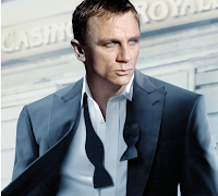
Action Thriller!
-Location changes
-Buff and athletic protagonist
-Aware of the plot straight away
-Mysterious
-Very dark scenes where there is action
-Unimportant people getting killed
-Hard to tell who is the protagonist and the antagonist
-Two sides to the character. The quiet side, and the violent side
 -Caring nature of the protagonist is usually bought out by a love interest of a child.
-The woman interest is always gorgeous
The Recruit
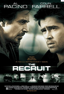 The clip we watched, was from the crime thriller The Recruit.
A. From the clip build up ideas on what you think the conventions of this sub-genre are.
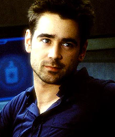 In this clip the protagonist we were introduced to (Colin Farell) seemed to be just a ordinary guy, working in a bar, but who could be very use full to the CIA if given the chance. We see the wake up in a messy looking room with a computer, running late to an important event. When he arrives we see that he is very intelligent with many ideas relating to computers. When Al Pachino is introduced to the audience, he is watching 'James' show off his new discovery at the event, and we can straight away identify his importance to the storyline. After this he arrives at James' bar that he works at, and introduces a theme in the film, James' dad. It becomes apparent to us that his dad is dead and that James is desperately seeking to find out how he died. In a crime thriller this type of theme is very typical, but the story of what the protagonist is seeking for changes. Having a main character that is very intelligent but seems to be unaware of this and is very un-organised, is another typical convention of this sub-genre.
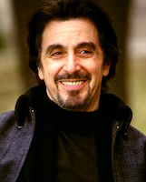 The location in this film is at the beggining set in the city which connects well to James' skatty lifestyle. But as his situation becomes more serious and he is recruited by the CIA, the location changes to a building that seems to be in the middle of no-where. The lighting in these locations always seems to be very dimmed and dark, which adds a mysterious feel to the film and is a common factor of a crime thriller.
Thursday, 13 January 2011
Memento Opening Sequence
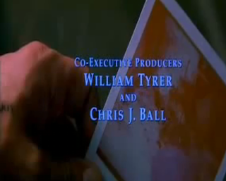 In class today we watched the opening sequence to the psychological thriller 'memento'. We focused on how micro-elements related to the conventions used in this film.
The film starts with a man is shaking a photograph, though rather than the photo developing, it is doing the opposite. This is an example of reversing of time which disorientates the sense of reality and continuity and gives the film a non-linear narrative. Also at this point in the film, as well as holding a photograph he has writing all over his hand which he uses to keep track of vital information, this is what first introduces the audience to his amnesia (Achilles heel). There is a tense non diegetic sound track which contributes to the sense of suspense.
The audience automatically knows the man is a protagonist because of his vulnerability and isolation as he cant make any new memories, due to his amnesia. A key point showing his amnesia is in the hotel room where he does not know how long he has been there, which is shown by the use of the main characters voice over, showing his stream of consciousness. This shows his lack of certainty and confusion. In this clip there is a high angle in the hotel room where he is wearing just a shirt and bare legs, this again shows his vulnerability. Throughout the hotel room scene it is in black and white, perhaps representing a flashback into the past, whilst this is happening there is a slow pace of editing and a close up of his eyes indicating confusion and drowsiness of the character.
From just the opening sequence the audience are made to believe that the main character is unreliable and dangerous, this shows the convention dual identity.
Labels:
Chloe Housden,
Heidi Izatt,
Sarah Jebb
Seven
We watched the opening 10 minutes to the thriller Seven. From the beginning of the film we could easily identify that the movie was a thriller due to the conventions we had re caped before viewing.
The film is set in the city, unlike a horror that would be commonly situated in the suburbs. We automatically know this by the sounds we hear from the streets (sirens and traffic).
The film is set in the city, unlike a horror that would be commonly situated in the suburbs. We automatically know this by the sounds we hear from the streets (sirens and traffic).
Labels:
Chloe Housden,
Heidi Izatt,
Sarah Jebb
Conventions of a Phycological Thriller.
This lesson we have been discussing psychological thrillers and watched an opening sequence to Memento!
We discussed the conventions and analysed them...
We discussed the conventions and analysed them...
- Central theme of identity- Mistaken identity, stolen identity, lost identity (amnesia), dual identity, doppelgangers.
- Perception- Often the narrative is shown from the perspective of multiple characters.
- Reality- Confusion between what is and isn't real. The main characters idea of reality is different to the normal established within the film.
- Memory- The torture of an individual by a traumatic memory. The traumatic search for a lost memory.
- Stream of consciousness- The viewer is invited to identify with the psyche of a particular character.
- Unreliable narrator- The person telling the story is discovered to be untrustworthy. This unnerves the viewer.
- Flashback- reversing and fast forwarding of events. Non linear narrative- Editing. We feel flashbacks in black and white are often used as it establishes the fact it is a flashback and also taking the colour out of a scene can take the feeling of life out of it.
- Imagery- The eye is a regular visual motif.
Labels:
Chloe Housden,
Heidi Izatt,
Sarah Jebb
Wednesday, 12 January 2011
Rear Window
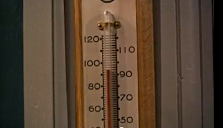 We watched the opening sequence to Rear Winder, to identify the conventions used to make the film a thriller. At first we both thought that all seemed to well for the film to be in this genre, but we then thought about it and realized that that is exactly what the film tries to do. Its luring the audience into a false sense of security by creating a sense of normality. It does this by using music that is joyful and upbeat, unlike the expected sinister sounds from a thriller movie. The surroundings help to trick the audience into believing that the story could be happy, by having summer weather and showing the high temperatures. Also the way the flats are laid out, all together creating a close neighbourhood feel, gives the impression its a safe place to live.
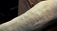
To establish the location, there is a long dragged out panning shot which introduces each of the neighbours at the their window but also represents the boredom of the protagonist as he is stuck in his wheel chair with a broken leg. His broken leg also shows he is weak, vulnerable and very isolated, meaning should anything happen to him, he would struggle to escape.
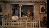
Another convention seen in the opening sequence is objectification of females. An example of this is when he is viewing another woman through his window into hers. She is dancing around in her underwear unaware of who can see her.
 The opening sequence does not introduce the antagonist to the audience, this is another way they make the audience feel safe as their is no threat.
The Opening Sequence.
Monday, 10 January 2011
Differences between horror films and thriller.
In our lesson today we distinguished the difference between horrors and thrillers.
Horror:
Horror:
- Horror films tend to be more gory
- The women are seen as the victims as they are more vulnerable
- The narrative is predictable
- The weapons used are different to add to the shock (usually bladed objects)
- The cast are often younger
- Horrors are usually set in a suburban setting as it creates a sense of loneliness for the victim(s)
- Adults are often absent or unhelpful which makes it more predictable
- More recent horrors tend to use a group of people as the victim rather than individual people, they are normally killed one by one.
Labels:
Chloe Housden,
Heidi Izatt,
Sarah Jebb
Conventions of a thriller
During our lesson today we discussed the different conventions included within a thriller film. We agreed that the main narrative focus of a thriller is on solving crime and usually involves the government in action thrillers. Sinister, eerie music and exaggerated sound effects are usually included to create suspence and the story of the film is normally scary and psychological. More experimental editing, such as, parrallel, non lined and montage. Binnary opposite characters, for example, the protagonist who is usually seen in peril and has a weakness which is usually referred to in the title. Another character would be the antagorist who normally causes problems for the protagonist.
Labels:
Chloe Housden,
Heidi Izatt,
Sarah Jebb
Thursday, 6 January 2011
Prelim task
For our coursework we had to include in our portfolio a preliminary task to ensure that we understand what continuity is. For this we had to include certain shot types. We had to include an establishing shot, a close-up, match on action, a reaction shot, a long shot, and we had to film a conversation using over the shoulder shots.
During our film, we included writing showing who starred in it and who the camera work was by, for this we used a new technique which was adding motion to the writing so it could move across the screen and we had control over where its started/stopped. We added the actors names to the film using motion over the filming, whereas at the end of the film we put who the camera work was by without using motion.
During our film, we included writing showing who starred in it and who the camera work was by, for this we used a new technique which was adding motion to the writing so it could move across the screen and we had control over where its started/stopped. We added the actors names to the film using motion over the filming, whereas at the end of the film we put who the camera work was by without using motion.
Labels:
Chloe Housden,
Heidi Izatt,
Sarah Jebb
Subscribe to:
Comments (Atom)


